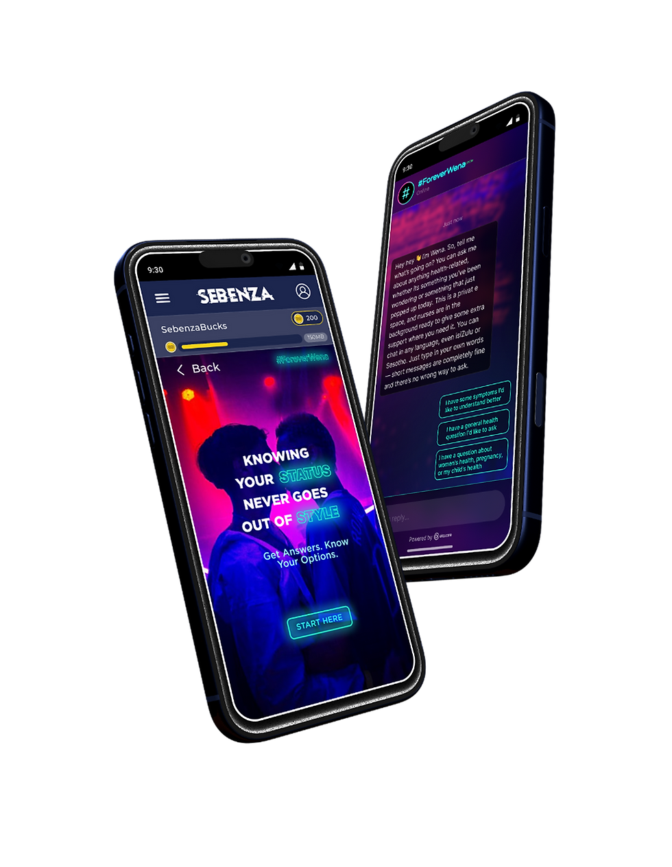
AI for Self-Care
Designing a more trustworthy AI-driven digital health experience
Client
Health- Gates Foundation (with Genesis Analytics)
Key deliverables
Task flows/ Journey assets | Conversation design | UX research | Creative Ad assets
Timeline
10 Months
Team
The team consists of 6 different partners with the Genesis team leading project management and service design, UX/UI design creative and content assets.
The Challenge
Forever Wena is an AI-powered health service designed to help young South Africans access health information and support through digital channels, including Sebenza and WhatsApp.
Testing revealed gaps in the experience. Users could navigate the service, but some were unsure what to do next, found parts of the conversation unnatural or did not understand when clinical support might become involved.
The challenge was to improve the experience beyond the chatbot itself, connecting conversation design, technology and the care available beyond the screen.
My Role
-
Shaping the end-to-end health service across digital touchpoints, conversations and clinical support.
-
Identifying opportunities to improve the service proposition, user engagement and connection to care.
-
Planning and conducting user testing, synthesising findings and translating observed behaviours into design opportunities.
-
Developing recommendations for conversation flows, messaging, symptom selection, escalation and follow-up.
-
Examining onboarding, consent, channel transitions, session continuity and the operational processes supporting the experience.
-
Translating research and service analysis into actionable improvements, distinguishing immediate fixes from longer-term work.
-
Lead creative refresh and conversation design work
-
Working across product, technology, clinical and delivery teams to align recommendations with implementation requirements and service constraints.
The Approach
-
Look beyond the chatbot: Treat Forever Wena as a wider health service, considering how digital interactions connect to clinical support, care-seeking decisions and operational processes.
-
Examine the assumptions behind the experience: Question whether users understood the service's purpose, trusted its guidance, knew what to do next and understood when a nurse might become involved.
-
Consider different entry points and user journeys: Account for differences between users entering through Sebenza and those accessing WhatsApp directly, including the implications for onboarding, consent and continuity.
-
Balance accessibility with clinical clarity: Consider whether language, symptom prompts and escalation messages helped users communicate their needs and understand appropriate next steps without creating confusion or unnecessary alarm.
-
Distinguish user experience issues from system constraints: Recognise that some problems could be addressed through conversation and interaction design, while others required technical investigation, clinical input or operational changes.
-
Prioritise trust and usefulness over conversation alone: Evaluate the experience in terms of whether it helped users make sense of their situation and navigate towards appropriate support, rather than simply whether the chatbot responded.
The Process
-
Understand the service: Review the existing experience, its entry points, channel transitions and intended relationship between AI guidance and clinical support.
-
Define test scenarios and questions: Examine key moments in the journey, including onboarding, symptom reporting, receiving guidance, escalation and follow-up.
-
Conduct user testing and review interactions: Observe how users interpreted the experience, where they encountered friction and how their expectations compared with the intended service.
-
Synthesise findings across the journey: Identify recurring usability issues, communication gaps, unmet needs and dependencies beyond the interface.
-
Translate findings into design opportunities: Develop recommendations for conversation flows, messaging, onboarding, symptom selection, escalation and continuity between channels.
-
Prioritise recommendations: Separate changes that could be addressed through immediate content or interaction improvements from those requiring further research, technical investigation, clinical validation or operational decisions.
-
Support cross-functional alignment: Present findings and recommendations to help the wider team understand the required changes, dependencies and next steps.
Figure 1 | Consolidated User Journey | Figjam
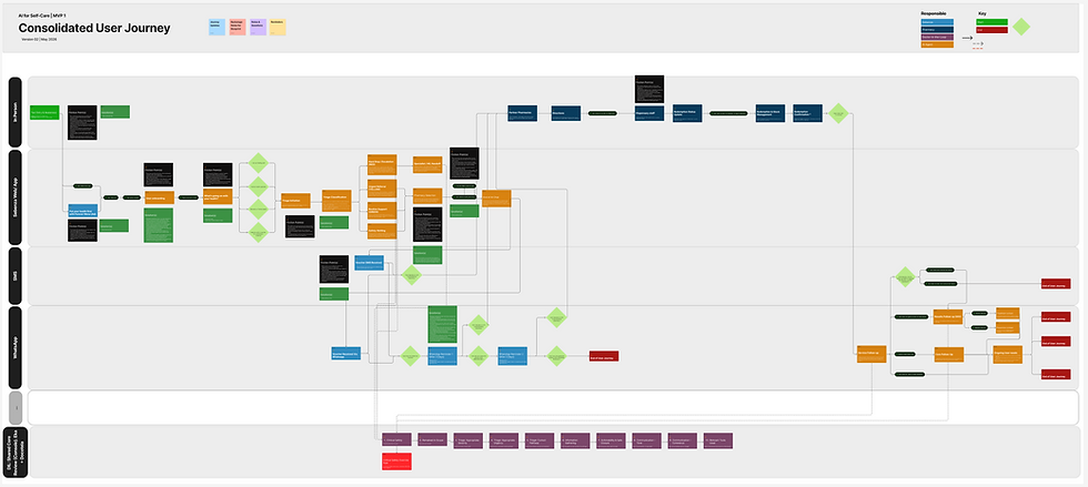
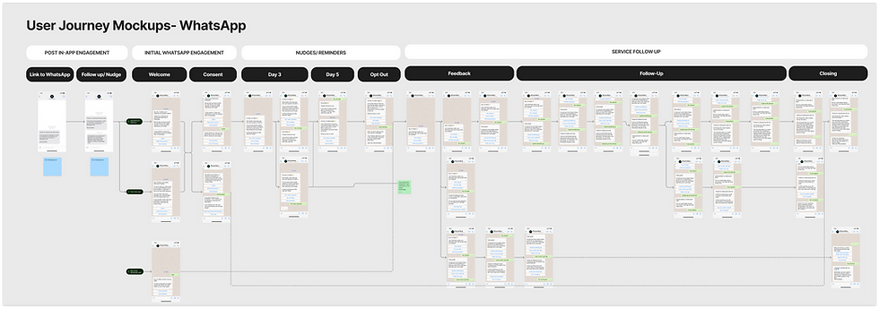
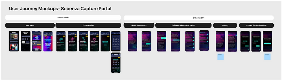
Figure 2 & 3 | UI mockups + visualised creative & conversation design outputs | Figjam
Outcomes & Impact
The audit gave the team a clear, prioritised set of usability and accessibility findings, each tied to a recognised principle, plus a redesigned prototype showing how the calculator could look and behave. This made problems visible and gave the developers specific changes to plan around, such as grouped resistance options, a reduced colour palette, standardised labels and spacing, and input validation. Serious barriers like contrast failures and lost progress when switching calculators were flagged as first priorities. For clinicians, the intended impact is a tool that is faster to scan, harder to misuse and more accessible. These benefits are intended, not yet measured.
Limitations & Learnings
-
Learnings: A tool can be technically correct and still fail its users, and in clinical software small friction can become errors under time pressure. Established frameworks made findings easier to defend and prioritise. Clinicians should shape decisions like how to group resistance options, so I would involve them earlier next time.
-
Limitations: Due to time, the redesign was not tested with clinicians before redesign, so there was no codes