
EDRWeb PWA
Extending EDR Web to the point of care without replacing it
Client
Health- The Aurum Institute - Gates Foundation
Key deliverables
User Research | Platform Audit | User Journey's | Platform UI | Testing | Roadmapped Features
Timeline
6 months- 1 year
Team
There was a small group (2-4) of senior stakeholders who oversaw the project at a programmatic level, 2 clinical advisors, a project Manager who worked with the tech team at WAMTech (I worked directly with only 2 tech leads)
The Challenge
EDR Web is a desktop-based platform that stores and manages patient data. It is powerful, but it ties access to a workstation which is not concussive with clinicians actual workflow when servicing a patient. The challenge was to create a mobile progressive web app, EDR Web Lite, that gives people access to the essentials away from a desk.
The tension that surfaced in the demo is the heart of the case: when both versions are shown side by side, stakeholders ask why they would use a web-based lite version when the full platform exists. The design problem is therefore also a positioning problem. EDR Web Lite has to earn its place by being clearly better for specific situations, not by being a smaller copy.
My Role
-
Defining the value proposition of Lite against the full platform
-
Shaping what belongs in Lite and what stays in EDR Web
-
Leading the design work including research, co-creation sessions with different stakeholders for input
-
Create task flows and user journeys
-
Produced wireframes for internal testing and interface design files for dev
-
Supporting the demo and the stakeholder conversation alongside the technical lead
My Approach
-
Complementary, not a replacement. Lite serves specific mobile moments. The full platform remains the home for comprehensive charting, complex workflows, detailed documentation and administration.
-
Designed for point-of-care use. Quick lookups of patient information, vitals, recent results or medication lists while at the bedside, without breaking the interaction to go to a computer.
-
Lightweight by intent. Streamlined flows for common tasks, such as checking an allergy status or recent vitals, so people don’t need the full platform for a quick check.
-
Progressive web app as the delivery model. No app store download or IT deployment, updates happen automatically, and it works on phones, tablets or any device with a browser. This suits staff who rotate between facilities, shifts or equipment.
-
A clear “when to use which” rule. Full EDR Web for depth and admin, EDR Web Lite for quick reference, bedside verification and time-sensitive lookups.
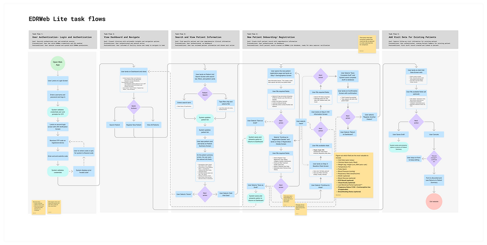
Figure 1 | Simple Task Flow Map with notes | Figjam

Figure 2 | Complete wireframes for MVP 1 | Figma
Outomes
-
EDR Web Lite reached pre-pilot / demo-ready stage within the grant period, giving stakeholders a concrete mobile experience to react to alongside the full EDR Web platform. The demo also surfaced the central positioning question early, why use a lite version when the full platform exists, which led to a clear rationale for when each should be used. Due to the work there was an agreed first-release scope and a clear basis for developer build.

Figure 3 | Feature Roadmap workshop artefact | Figma
Limitations & Learnings
The work has clear limits. Government sign-off to speak with clinicians was delayed, so most design decisions proceeded with minimal clinician input and remain assumptions to validate. Grant duration and team capacity meant not everything planned was delivered, and I was not part of testing, so no usability results are claimed. Widespread adoption is not expected yet. Government mandates paper as the source of truth, so a digital record currently duplicates work for staff, and without field rollout the value of Lite remains a hypothesis rather than a demonstrated result.
The biggest lesson was to treat approvals as part of the critical path. Clinician access depended on government sign-off outside the team’s control, so approvals need to start earlier, and the plan needs to survive delays without squeezing validation out entirely. Where input is limited, an explicit assumptions log keeps decisions traceable and shows what to test first once access opens.
I also learned that in an environment where paper is the mandated record, digital tools must reduce duplication rather than add to it. That points to designing around the paper reality, for example by mirroring its structure or starting with read-only lookups. Finally, grant-funded work benefits from a deliberately small first slice that is complete and testable, and the stakeholder’s question showed that positioning two versions together is part of the design, not an afterthought.

Figure 2 | UI screen designs for MVP 0 alongside MVP 1 for end to end testing | Figma